


Daily Market News - 22nd June 2022

A Violent Rally In The Making?
The S&P500 has dropped for 10 of the last 11 weeks.
While many are losing their minds assessing it all, I prefer to call it a downtrend. That’s just how markets work.
In this weeks letter I’m going to lay out a mildly bullish case for stocks and share a few of the charts I’ve shared with our clients and members over the last couple of weeks.
A lot has to happen for things to play out, but the charts make sense to me, so I think they’re worth keeping an eye on.
If you missed last weeks letter, where I covered The Charts That Matter or the call I made on the Top in Energy on 8th June they’re maybe worth checking out too.
Before you say it though, I already know the economy’s a shit show and I know we’re heading toward Armageddon, and I also know many important charts are breaking down, but that doesn’t mean we can’t make money from the inevitable Bear Market Rally for as long as that lasts does it? Even if it’s just a few days.
So lets start with Tech.
Technology Chart (QQQ)

I like to assess each chart on its individual merits and figure out what the chart respects, I don’t like to pigeon hole myself as a Fibonacci guy, or a AVWAP guy etc etc, I like to take the time to figure out where risk : reward propositions make sense and for me, if the market (and Tech) is going to put in some kind of over sold rally, the QQQ chart is approaching a level where that MIGHT happen.
A close BELOW the 200 Week Moving Average and we’re probably seeing more Armageddon type stuff in the markets.
Lets look at the 10Yr.
10Yr Treasury Note Yield (TNX)
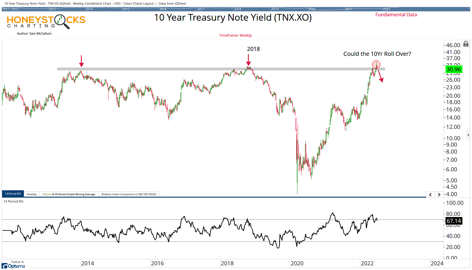
For me, the key to a sustained market rally, beyond the 1 or 2 days we get here and there (which I should add I mostly sit those out as I’m not a day trader) is the 10Yr Treasure Note Yield.
It needs to roll over, if it does that, it might make sense to get involved to the up side.
Lets take a look at TLT.
20Yr Treasury Bond ETF (TLT)

Given the inverse relationship between TLT and TNX, if TLT puts in a failed break down, it could be a bullish catalyst for everything, so I’m paying attention here also.
Moving onto Crypto.
Ethereum (ETH)

This was the chart shared with clients / members last weekend, I think I may have posted it to Twitter also.
I like to utilise data on charts like this to compare previous over sold readings and to compare the rallies.
For me, when sentiment gets overly bearish, when the headlines are being thrown around, I like to take a look at the other side of the coin, ETH is now up somewhere around $1150-1200
Is that as far as it gets? I don’t have the answer to that, but it’s often a worthwhile exercise to build out the chart instead of paying attention to headlines.
How about China?

Did China bottom without anybody talking about it?
In my world we call this relative performance, the Shanghai Composite is -0.12% over the last 3 months and the Hang Seng -5.17% while the US Markets have been getting cremated.
That’s information I want to pay attention to.
The final thing I should add is that these charts have not confirmed anything and it’s all conjecture, I also reserve the right to flip my views on 30secs notice, I learned that from Stan Druckenmiller.
If you missed our social media analysis at the weekend, you can check that out below too.
Our Big Time Stamped Market Calls